DE LUNE
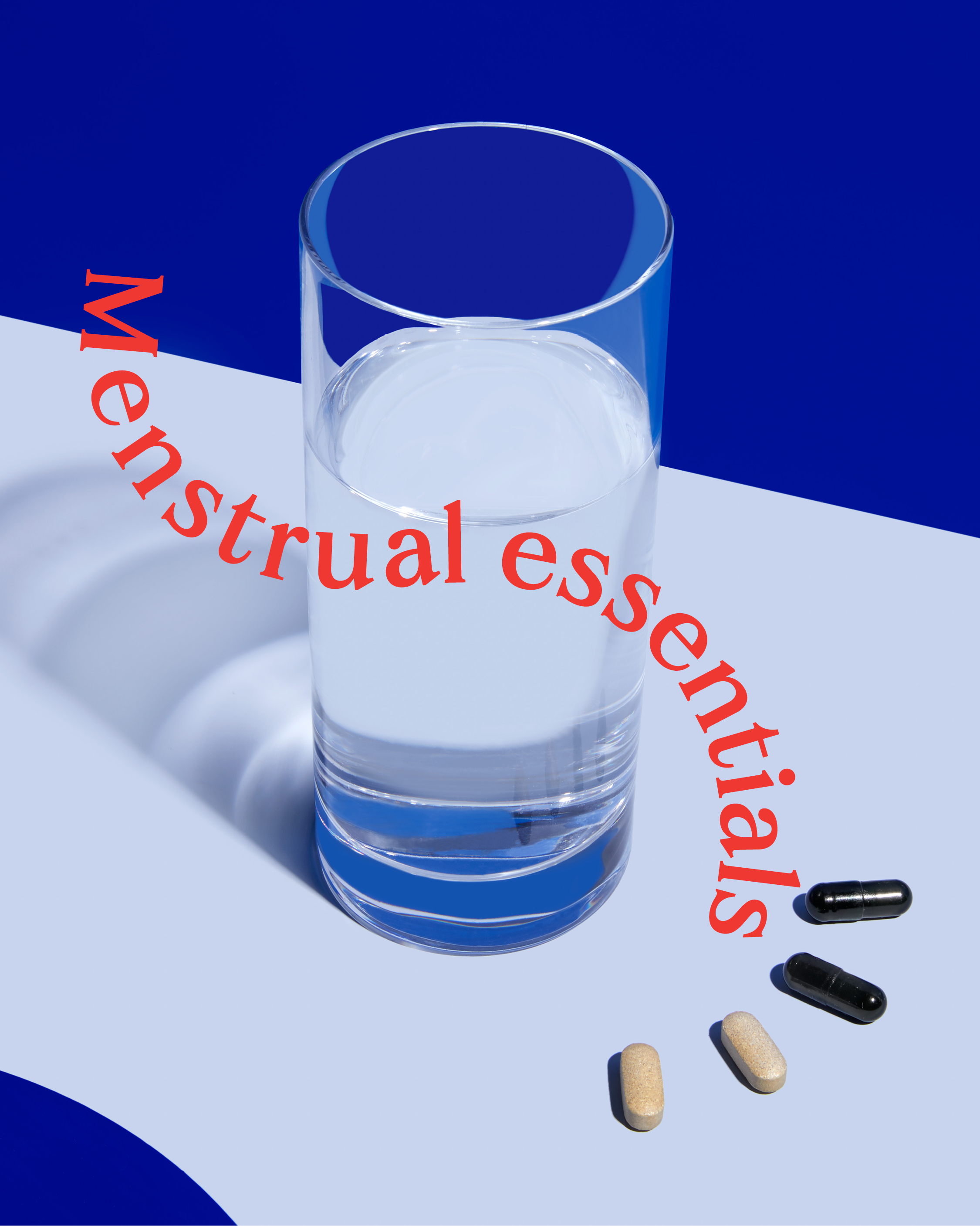
Despite the prevalence of disruptive symptoms, menstrual health is still wildly underserved. Painkillers, heating pads, and “powering through” just don't cut it. There’s an urgent need for real relief with fewer side effects and more nourishing ingredients.
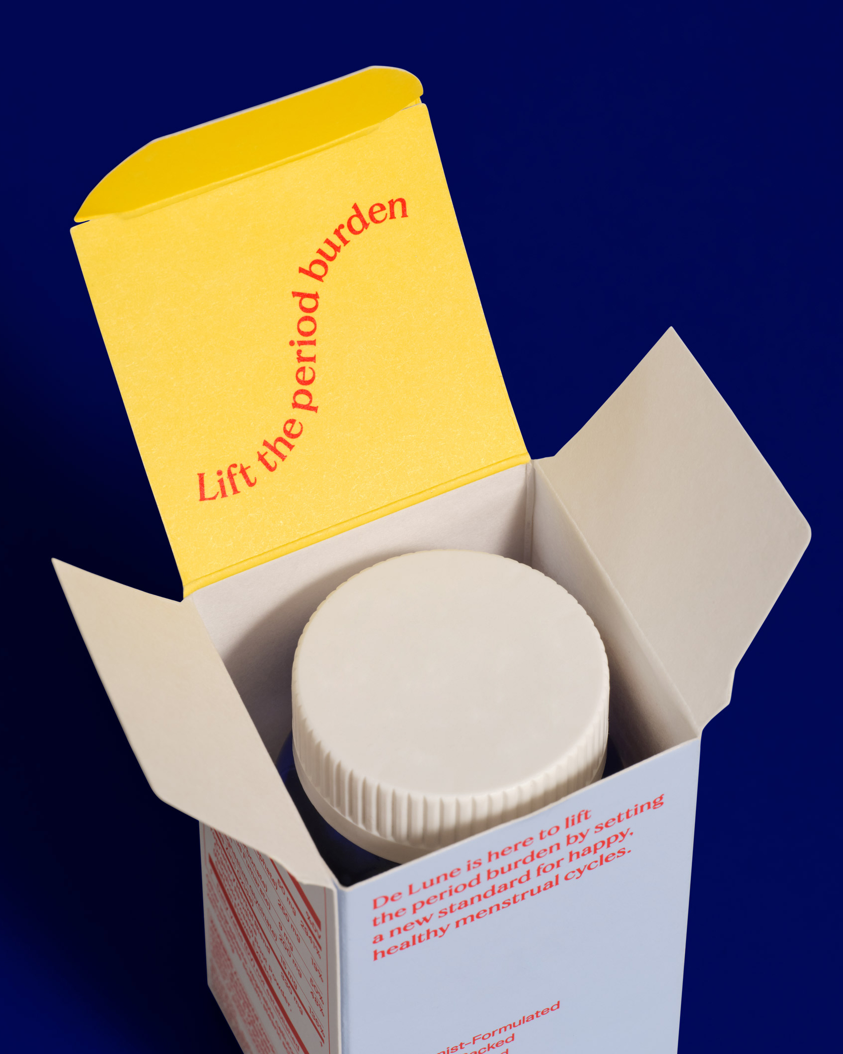
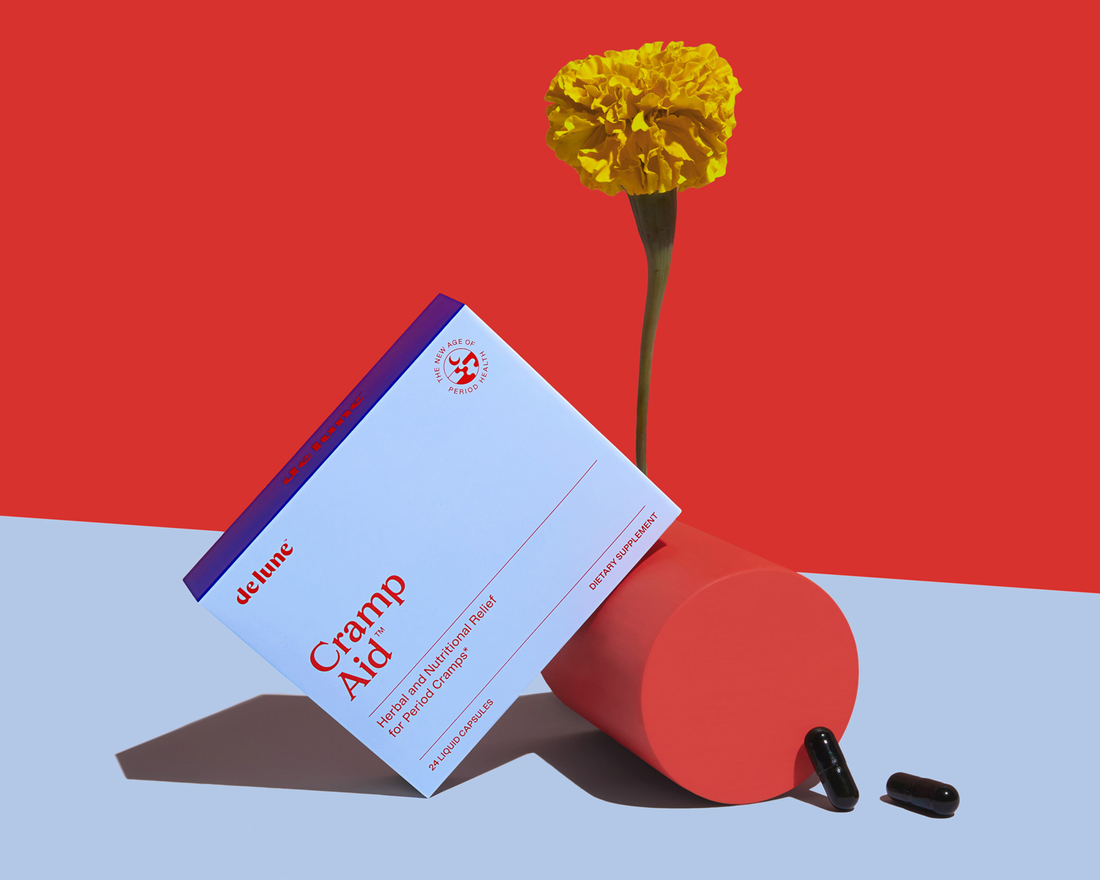
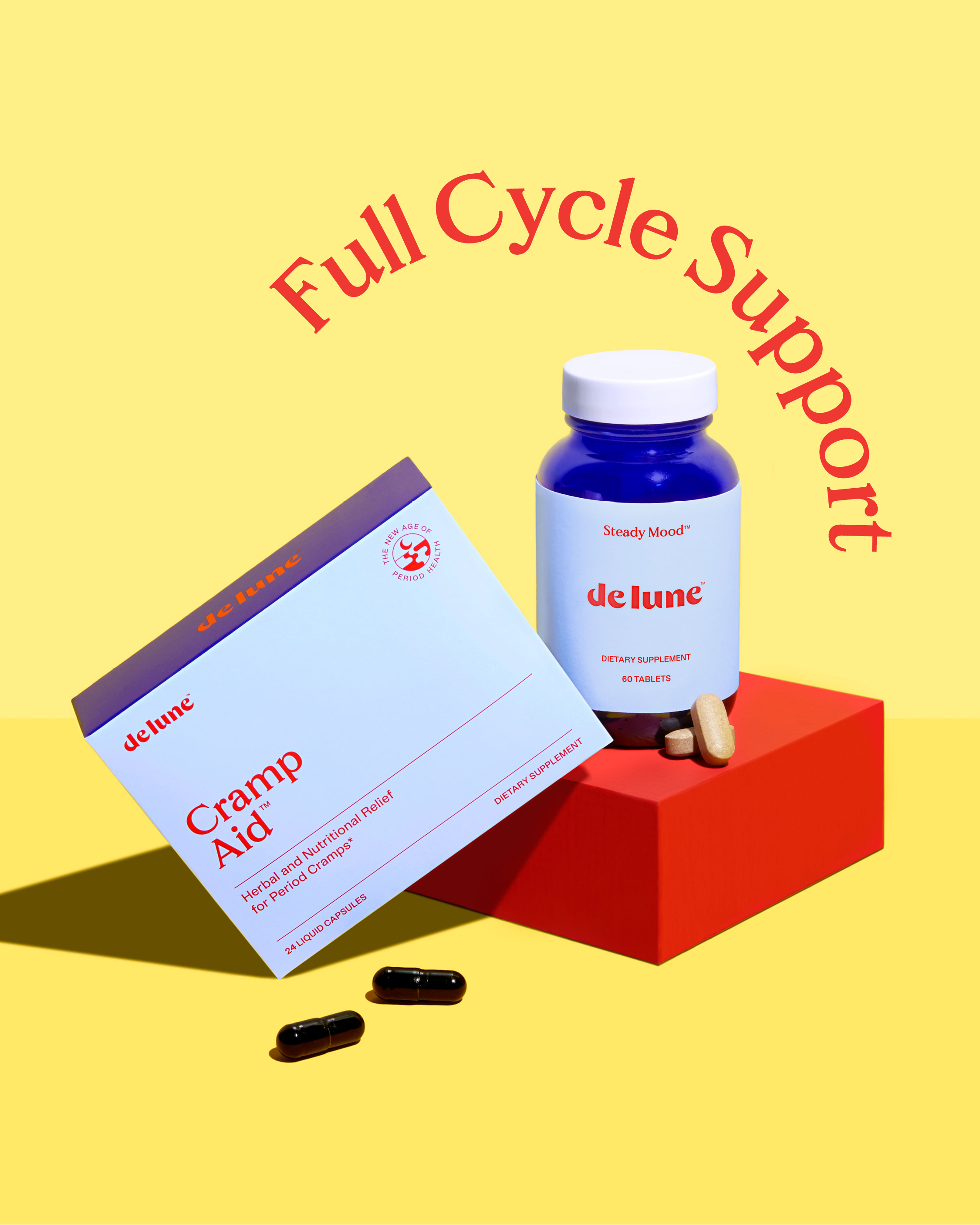
De Lune lifts the period burden by providing researched-backed, natural menstrual essentials that offer real relief for cramps, mood swings, and other common symptoms.
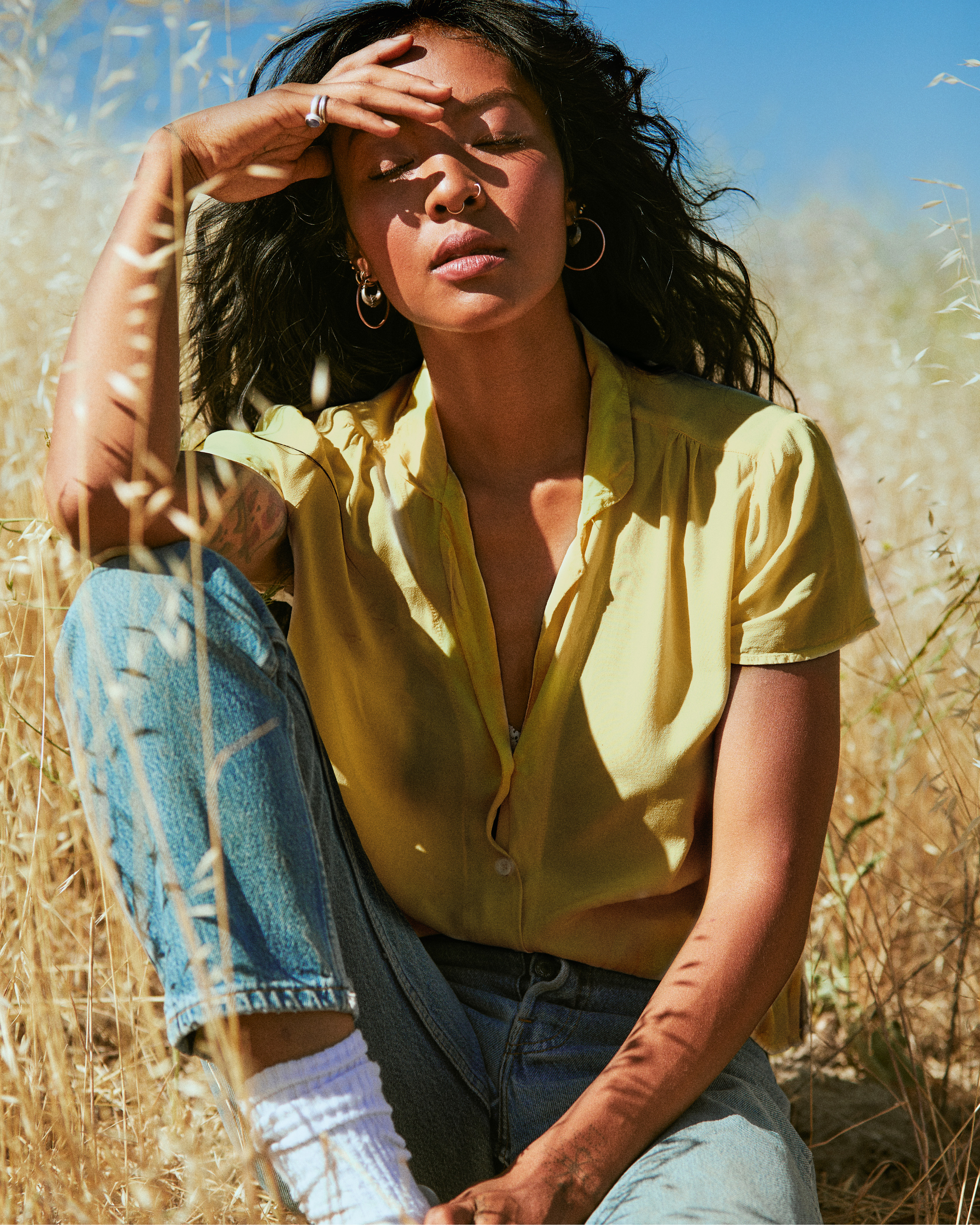
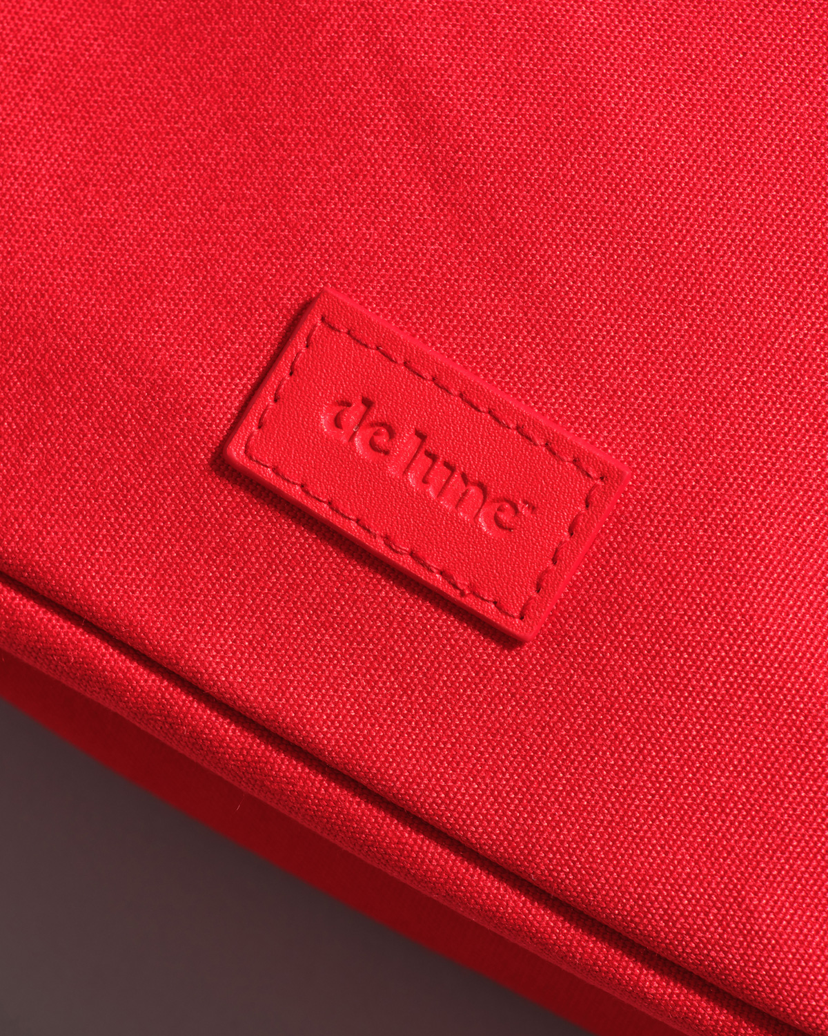
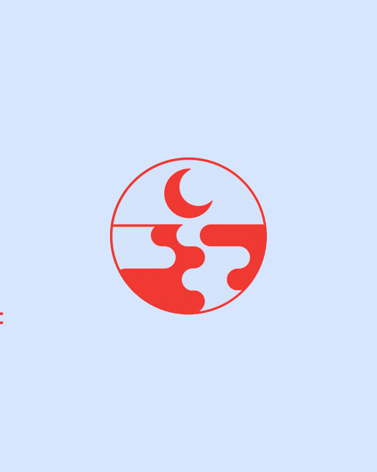
Looking to reach a wider audience and scale their business, De Lune came to us for an identity refresh including packaging design. We worked closely with the De Lune team to create a system that uses moon and tide iconography with a high contrast color palette expressing the ups and downs of full cycle health, not just a focus on the period.
︎︎︎ Visual Identity
︎︎︎ Verbal Identity
︎︎︎ Packaging Design
︎︎︎ Art Direction